Designing a 2D Transformer Core: Post-processing with ParaView (Part 3)
We have arrived at the final part of this design series! Throughout this process, we followed some straightforward steps using exclusively Graphical User Interfaces (GUI) to perform a steady-state simulation. If you missed them, you can check out Part 1 and Part 2 of this series.
I will eventually address a more robust workflow for advanced analysis and tools. For now, however, it is essential for newcomers to understand these fundamental first steps.
ParaView
The first thing we need to do is open our .vtu result file.
- Load the file. In the Pipeline Browser (the menu on the left), ParaView will show the file with a green box next to it, indicating it hasn’t been applied yet.
- Below that, in the Properties panel, you will see the configuration options. This is where we adjust our results.
- Click the Apply button, and the geometry will appear in the Render View.
- Now, in the top toolbar (or the Properties window), change the visualization representation from Solid Color to magnetic flux density e.
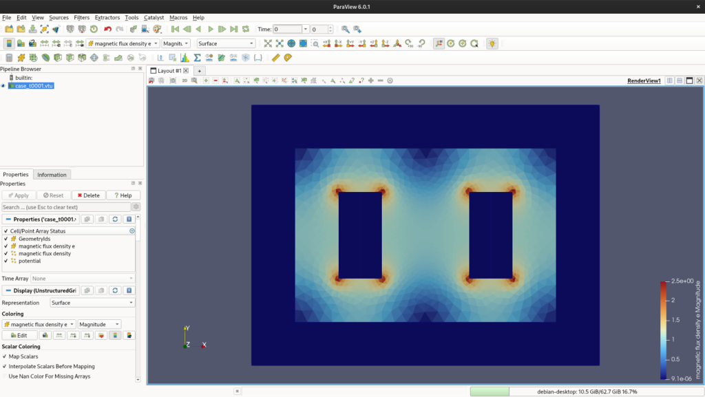
.vtu file in the Pipeline Browser and the magnetic flux density distribution in the Render View.You will notice that the magnetic flux is displayed in the form of elements (triangles) or nodes. The triangle view often looks a bit sharper because the data is self-contained within the boundaries of each element. The node view, on the other hand, averages the values of adjacent elements. If you play around with it, you will notice a blurring effect across the entire geometry.
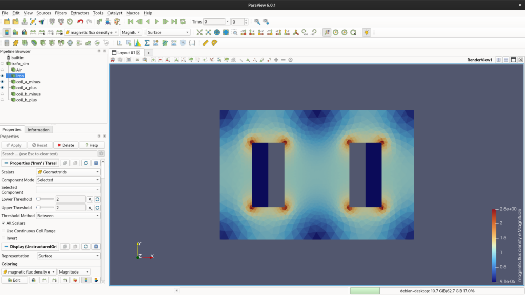
Isolating Components: Breaking the Bodies
To visualize our results better, we need to separate the different materials. We will do this using the Threshold filter.
- Click on your
case_t0001.vtufile in the Pipeline Browser (feel free to rename it to something meaningful). - Go to the top menu: Filters > Search… and type Threshold. Hit Enter.
- We will now reference the body numbers we set up in Elmer (e.g.,
1for Air,2for Iron, etc.). - In the Threshold Properties panel, find the Scalars dropdown menu and select GeometryIds.
- Set both the Lower Threshold and Upper Threshold to
1, then click Apply.
You will notice that only the air body is now visible. Rename this threshold in the Pipeline Browser to “Air”. Repeat this exact process for the other parts (Iron, Coils).
⚠️ Important note: In ParaView, filters are applied to the currently selected item in the pipeline. Make sure you select the original .vtu file (the parent element) before adding a new Threshold, otherwise, you will try to apply a Threshold to an existing Threshold!
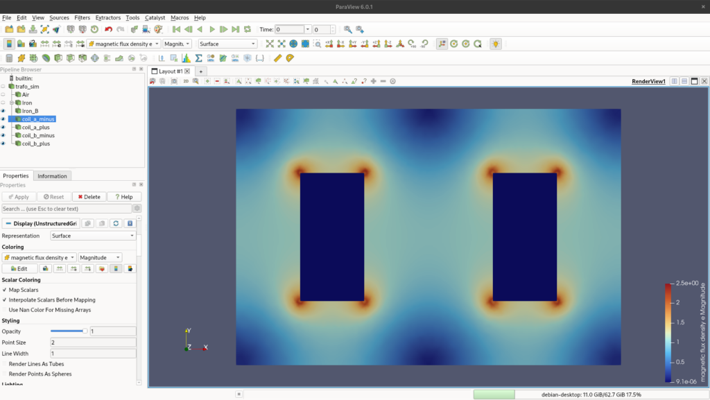
GeometryIds.Smoothing the Data: Cell Data to Point Data
Now that we can see the individual bodies, we can improve their visual representation.
Select the “Iron” body in the pipeline and apply the filter Cell Data to Point Data (using the Search menu). This filter will interpolate the constant values within the elements to the nodes, resulting in a much smoother and more professional-looking color gradient.
From here, you can change the color map (the legend) and axis limits. For now, I will just leave the default options.
Drawing Flux Lines: The Contour Filter
A classic way to evaluate electromagnetic machines is by looking at the flux lines. We can achieve this using the Contour filter.
- Select the smoothed “Iron” body in the pipeline.
- Search for and apply the Contour filter.
- In the Properties panel, change the Contour By field to potential (which represents the magnetic vector potential).
- Look for the Isosurfaces section. Clear the default value, click on Add a range of values, choose the number of samples you want (e.g., 15 or 20), and generate them. Click Apply.

Extracting Data: Plot Over Line
The last post-processing technique we will cover is extracting the normal flux density over a specific line. This is crucial for evaluating core saturation.
- Select the parent “Iron” body in the pipeline.
- Search for and apply the Plot Over Line filter.
- In the Properties panel, define the coordinates (
Point 1andPoint 2representing<x, y, z>) to draw a line across the section of the core you want to analyze. Click Apply. - A new line chart window will open. In the Series Parameters (Display properties), make sure you check only the variable of interest, such as magnetic flux density e_Y (if your line is horizontal).
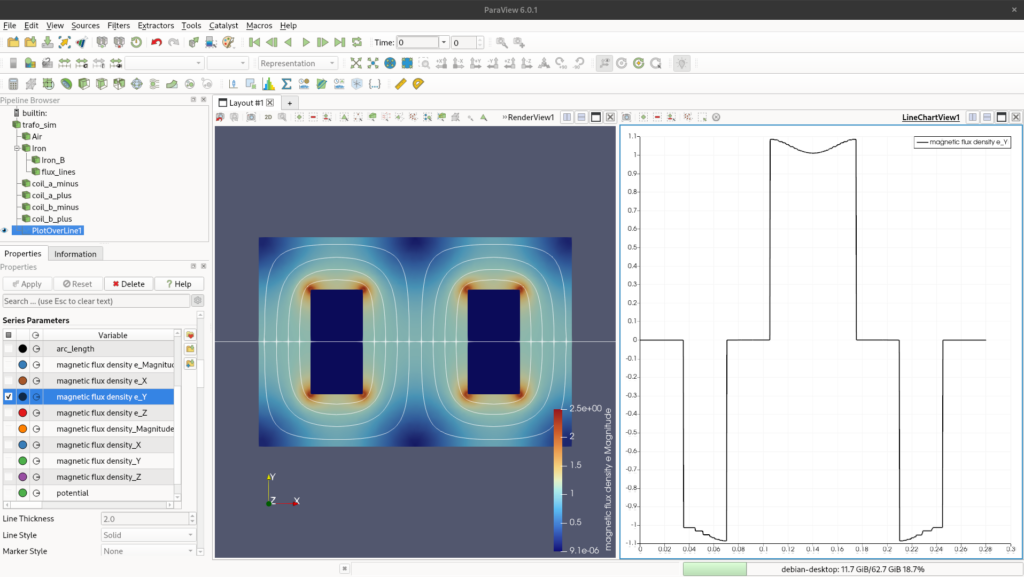
e_Y) across a defined cross-section using the Plot Over Line filter.Conclusion
There are far more powerful tools and filters inside ParaView, but these are the most relevant ones for a basic post-processing evaluation of our 2D model.
Now, we need to step back into Elmer and start playing serious, but that will be the topic for another discussion!